QR Code Color, Size & Print Guide — PNG vs SVG, Best Paper, High Resolution Tips
Admin
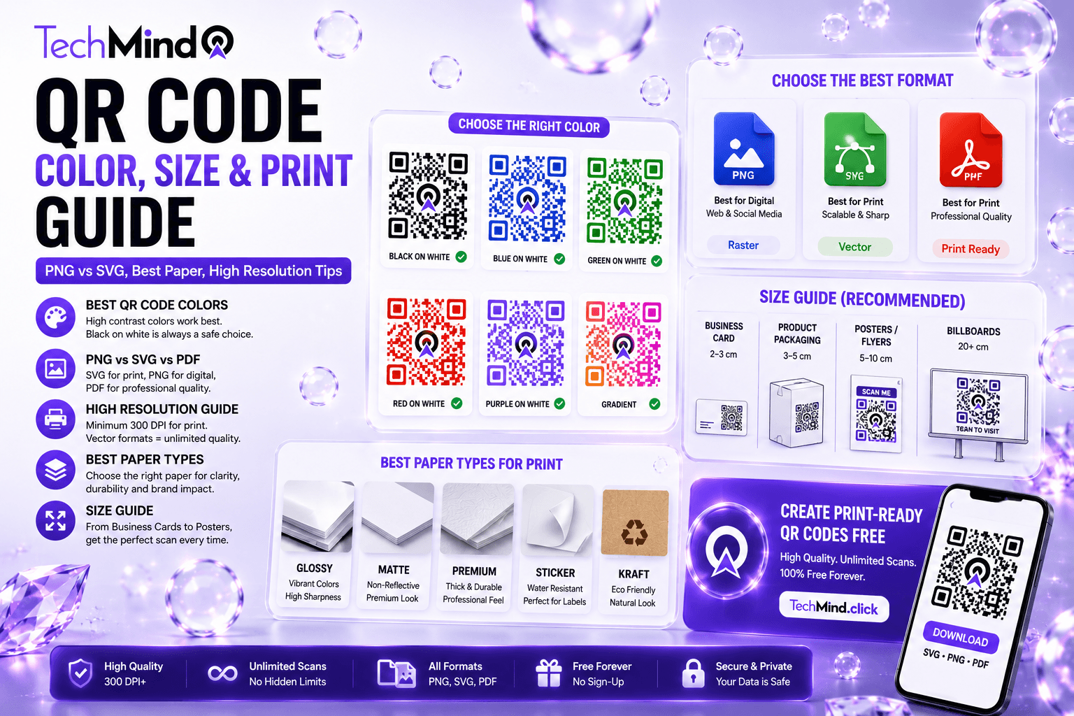
Steve Jobs once said, "Details matter, it's worth waiting to get it right." A QR code that fails to scan because of the wrong colour, a pixelated download format, or the wrong paper stock is a detail that went wrong — and it shows at exactly the moment a customer, guest, or colleague is trying to engage with your brand. This guide covers every variable that affects whether a printed QR code scans reliably: colour and contrast, file format, resolution, paper type, and size. All in one place, with exact numbers you can use.
Every QR code in this guide can be generated free at TechMind.click — custom colours, logo embedding, SVG download for professional printing, no sign-up required.
Best QR Code Colour — The Rules That Determine Whether It Scans
As Albert Einstein said, "If you can't explain it simply, you don't understand it well enough." The colour rule for QR codes is simple: use dark colours for the QR code pattern and light backgrounds. A black QR code on a white background offers the highest possible contrast and is universally recommended.
The reason is mechanical. A QR code scanner — whether a dedicated app or a smartphone camera — works by detecting the contrast between the dark modules (the filled squares) and the light background. If that contrast drops below a usable threshold, the scanner cannot distinguish the pattern from its surroundings. A minimum contrast ratio of 4:1 between the foreground and background is required for reliable scanning. Black on white provides approximately 21:1 contrast — the gold standard.
The colour hierarchy for scan reliability:
- Black on white — 21:1 contrast ratio. Scans in any light, on any scanner, at any reasonable size. Always use this as your baseline.
- Dark navy on white — approximately 15:1 contrast. Excellent reliability, professional appearance.
- Dark green on white — approximately 14:1. Reliable and brand-appropriate for many contexts.
- Dark charcoal on cream — approximately 12:1. Works well for premium print materials.
- Dark brown on white — approximately 11:1. Reliable for most scanning conditions.
- Medium blue on white — approximately 5:1. Acceptable but test rigorously before printing.
- Red on white — approximately 4:1. Borderline. Accessible concern (red-green colour deficiency affects 8% of men).
- Light colours on white — below 4:1 threshold. Will fail to scan. Do not use.
Black vs Coloured QR Codes — Which Should You Use?
APJ Abdul Kalam said, "Excellence is a continuous process and not an accident." Choosing between black and coloured QR codes is not a binary decision — it is a question of purpose, context, and how carefully the colour is chosen.
A plain black-on-white QR code works. Branded codes in recognisable colours often get 30–50% more scans than generic ones, because people trust what looks familiar more than a mystery grid. Colour only pays off if you still respect contrast.
The data supports both sides of this: black QR codes are more reliable under adverse conditions (low light, glare, fast scanning), but branded coloured codes generate more initial scans because users trust the visual context. The answer for most use cases is a branded coloured code — but only if the colour combination passes the contrast test.
When to use black QR codes:
- Outdoor signage subject to variable light and weather
- Very small print (under 2 cm) where every pixel of contrast matters
- Industrial labels, packaging with complex backgrounds
- Any context where the code will be used in low light
- When you cannot test the printed output before the print run
When coloured QR codes work well:
- Business cards and professional materials where brand consistency matters
- Restaurant table cards with controlled lighting
- Event posters and flyers in well-lit indoor venues
- Product packaging where the QR code is a brand touchpoint
- Social media QR codes (Instagram, Facebook, LinkedIn) where platform colours drive trust
Colour combinations that fail — avoid these completely:
- Light code on dark background — many scanners will not recognise a light QR code on a dark background. Colours must never be inverted from the dark-on-light rule.
- Red on green or green on red — approximately 8% of men and 0.5% of women have red-green colour vision deficiency. A red QR code on a green background may be functionally invisible to those users.
- Similar tones — dark blue on black, light grey on white — both below the 4:1 threshold
- Pastel colours as foreground — pastel hues that are too soft may come out lighter after printing, further reducing contrast below the scanning threshold.
The grayscale test — use this before every print: Test your colour choices in grayscale. If the foreground and background are difficult to distinguish in grayscale, the contrast is too low for reliable scanning. Open your QR code in any image editor, convert to grayscale, and check whether the dark and light areas are clearly distinct. If they merge, the colour combination will fail under real-world scanning conditions.
15 Colour Combinations That Work — Ready to Use
As Warren Buffett said, "Risk comes from not knowing what you are doing." These 15 colour combinations have been tested for contrast and reliability. Use them as starting points when building a branded QR code:
| Foreground (Dark) | Background (Light) | Contrast Ratio | Best For |
|---|---|---|---|
| #000000 Black | #FFFFFF White | 21:1 | All uses — universal baseline |
| #1a1a2e Dark Navy | #FFFFFF White | 17:1 | Professional / corporate |
| #0d3b2e Dark Green | #FFFFFF White | 14:1 | WhatsApp brand · eco brands |
| #1a237e Indigo | #FFFFFF White | 13:1 | LinkedIn · tech brands |
| #4a1942 Dark Purple | #FFFFFF White | 13:1 | Premium / luxury brands |
| #7b1f00 Dark Red-Brown | #FFFFFF White | 12:1 | Food · hospitality |
| #000000 Black | #FFF9C4 Cream Yellow | 18:1 | Premium print · stationery |
| #1a237e Indigo | #E3F2FD Light Blue | 9:1 | Healthcare · technology |
| #0d3b2e Dark Green | #F1F8E9 Light Green | 10:1 | Sustainability brands |
| #4a1942 Dark Purple | #F3E5F5 Lavender | 9:1 | Beauty · wellness |
| #212121 Charcoal | #FAFAFA Off-white | 16:1 | Minimalist · editorial |
| #BF360C Dark Orange | #FFFFFF White | 8:1 | Retail · food delivery |
| #004D40 Teal | #FFFFFF White | 11:1 | Healthcare · finance |
| #1B5E20 Forest Green | #FFFFFF White | 13:1 | Agriculture · sustainability |
| #000000 Black | #E8F5E9 Mint | 19:1 | Health · wellness · organic |
All of these colour combinations are available as custom foreground and background colours in TechMind.click's QR Code Generator — enter the hex code directly in the colour picker.
Can You Print QR Codes in Black and White?
Yes — and for many use cases, black and white is the best choice. The classic combination — black on white — provides the maximum possible contrast and should always be your baseline. When applying brand colours, keep the foreground dark and the background light.
Black and white QR codes offer four specific advantages over coloured ones:
- Maximum scan reliability — 21:1 contrast ratio works under any lighting condition, at any size above the minimum
- No colour shift on printing — digital screens use RGB colour and professional printers use CMYK. Sending an RGB file to a printer causes automatic conversion that can produce colour shifts reducing contrast between the QR code foreground and background. Black and white is identical in both colour spaces — no conversion risk.
- Works on all paper stocks — including newsprint, recycled paper, and kraft paper where colour accuracy is unpredictable
- Lower printing cost — black-only or greyscale printing is cheaper than full-colour on most commercial printing workflows
The only scenario where black and white QR codes underperform coloured ones is brand recognition — branded codes in recognisable brand colours get more initial scans because users trust the visual context. If brand consistency and scan-rate optimisation are both priorities, use a dark brand colour (not black) on a white background — maintaining high contrast while adding brand recognition.
PNG vs SVG vs PDF — Which Format to Download for Every Use Case
As Maya Angelou wrote, "Words mean more than what is set down on paper." The format your QR code is printed in determines whether it stays sharp at any size or degrades into a pixelated blur on a business card or a poster. This is the single most impactful technical decision in the QR code printing workflow.
SVG (Scalable Vector Graphics) — Always choose this for print: Export QR codes as vector files (SVG or EPS) for any print use case. SVG stores the QR code as mathematical instructions — lines, curves, and shapes — rather than pixels. This means it scales to any physical size without losing sharpness. The same SVG file that prints crisply on a 2.5 cm business card will print crisply on a 2 metre event banner. TechMind.click offers free SVG download on all QR codes.
PNG (Portable Network Graphics) — Use for digital, with conditions for small print: PNG is a lossless raster format — it preserves quality when exported at the correct DPI but will pixelate if scaled beyond its original resolution. Always export PNG at a minimum of 300 DPI for any print use case. For print, generate your PNG at a high pixel count — at least 3,000 × 3,000 pixels for most applications. A 1-inch QR code at 300 DPI needs at least 300 × 300 pixels. A 4-inch code needs 1,200 × 1,200 pixels.
PDF (Portable Document Format) — Use for direct printing: PDF stores QR code data as vector instructions (the same principle as SVG) and is the standard format for sending files directly to commercial print shops. TechMind.click's PDF download is ready to send to any printer without additional software. Use PDF when you are submitting a file for production printing and the print shop accepts PDF (which all do).
JPEG — Never use for QR codes: JPG / JPEG uses lossy compression, which introduces visual artefacts into the precise module structure of a QR code. These artefacts are invisible on screen but disastrous when printed, frequently rendering the code unscannable. JPEG is always the wrong choice for QR codes.
| Format | Scales Losslessly? | Best For | Avoid When |
|---|---|---|---|
| SVG | ✅ Infinite scale | All print — business card to billboard | Platforms that don't support SVG (use PNG) |
| ✅ Vector-based | Sending to print shop directly | Web or social media use | |
| PNG | ❌ Fixed pixels | Digital screens, social media, email | Enlarging beyond source resolution |
| JPEG | ❌ Lossy | Nothing — never use for QR codes | Always — compression destroys modules |
High Resolution QR Codes — DPI Requirements by Use Case
Winston Churchill said, "Success is not final, failure is not fatal: it is the courage to continue that counts." A QR code printed at the wrong resolution does not fail gracefully — it fails completely. A blurred or pixelated module structure renders the code unscannable. For high-quality printing of a QR code, a minimum of 300 DPI is recommended. At this resolution, small elements will be clear. If you print with a lower DPI, the edges of the modules may be blurred and the code will become difficult to scan.
DPI requirements by print use case:
| Use Case | Minimum DPI | Recommended DPI | Format |
|---|---|---|---|
| Business card | 300 DPI | 600 DPI | SVG or PNG 600+ |
| Flyer / brochure | 300 DPI | 300 DPI | SVG or PNG 300+ |
| Restaurant menu / table card | 300 DPI | 300 DPI | PDF or SVG |
| Product packaging | 300 DPI | 600 DPI | SVG |
| A4 / A3 poster | 150 DPI | 300 DPI | SVG |
| Large format banner | 72 DPI | 150 DPI | SVG |
| Billboard | 30–72 DPI | 72 DPI | SVG |
| Digital screen | 72 PPI | 150 PPI | PNG |
| Retina / HiDPI screen | 144 PPI | 192 PPI | PNG or SVG |
The DPI shortcut: Download SVG from TechMind.click and you never need to think about DPI. SVG is resolution-independent — it prints at the native resolution of whatever device or press you use, which is always the highest possible quality.
Best Paper for Printing QR Codes
As Steve Jobs said, "Design is not just what it looks like and feels like. Design is how it works." The paper stock your QR code is printed on affects how the ink sits, how the edges of each module look, and how the code performs under real scanning conditions.
The choice of printing method and material significantly impacts the final quality and durability of the QR code. Digital printing is ideal for shorter runs and variable data. Offset printing is suited for large volumes, providing high quality and consistent results. Screen printing is versatile for various surfaces including fabric, glass, plastic, and metal.
Paper types and their QR code performance:
Coated matte paper — Best overall for QR codes: Coated matte paper has a smooth surface that prevents ink from spreading into adjacent modules. This keeps the edges of each dark square crisp and the boundary between foreground and background sharp. Recommended for business cards, menus, and any material where scan reliability is the priority. Glare is minimal, which also helps scanning in bright conditions.
Glossy paper — Good but watch for glare: Glossy paper produces vivid colours and high contrast between dark modules and light backgrounds — which is excellent for scan reliability in principle. The problem is glare: direct light reflecting off a glossy surface can blind the scanner at certain angles. If using glossy paper, ensure the user will not be scanning under direct overhead lighting. For packaging under supermarket fluorescents, glossy can fail where matte would succeed.
Uncoated / recycled paper — Use with caution: Uncoated paper absorbs ink differently than coated stock — ink spreads into the fibres, which can cause module edges to bleed and blur. This is particularly problematic for small QR codes (under 3 cm) where module size is already at or near the minimum. If using uncoated paper, size up the QR code by 20–30% compared to coated stock recommendations, and test the printed output rigorously before committing to a run.
Kraft / brown paper — Size up and test: Kraft paper has two challenges: the brown background reduces contrast with dark ink (a dark QR code on brown provides less contrast than on white), and the uncoated surface causes ink spread. If brand consistency requires kraft paper, use the darkest possible foreground ink, size up the QR code significantly, and test on the actual paper stock before the print run.
Vinyl / plastic / metal — Specialist inks required: For QR codes on durable materials — outdoor signage, equipment labels, vehicle wraps — specialist UV-resistant inks and substrates are needed. The contrast and resolution rules remain identical, but the ink must be appropriate for the surface. SVG format is essential for these applications since the QR code is typically scaled to large sizes.
Summary — Paper recommendation by use case:
| Use Case | Recommended Paper | Watch Out For |
|---|---|---|
| Business card | Coated matte 350gsm | Very small codes — use SVG |
| Flyer / brochure | Coated matte 150gsm | Nothing significant |
| Restaurant menu card | Coated matte or gloss 300gsm | Gloss glare under direct light |
| Table tent / table card | Coated matte 300gsm | Laminate adds glare — use matte laminate |
| Product packaging | Coated label stock | Curved surfaces — size up 30% |
| Event poster | Coated silk 170gsm | Nothing significant for indoor use |
| Outdoor signage | Weatherproof vinyl | UV fade — use UV-resistant inks |
| Kraft / natural packaging | Kraft (test first) | Low contrast, ink spread — size up |
The Complete Pre-Print QR Code Checklist
Mahatma Gandhi said, "In a gentle way, you can shake the world." A QR code that scans reliably every time is a gentle, permanent bridge between physical and digital. This checklist ensures it works before you commit to a print run:
- ☐ Colour contrast — foreground darker than background, minimum 4:1 ratio
- ☐ Grayscale test — foreground and background clearly distinct in greyscale
- ☐ No colour inversion — dark modules on light background, not reversed
- ☐ No red-green combination — accessibility issue affecting 8% of men
- ☐ Format is SVG or PDF — never JPEG, PNG only if source resolution is sufficient
- ☐ Resolution — 300 DPI minimum for close-range print, SVG for all print
- ☐ Size correct — minimum 2 × 2 cm for close scanning, 10:1 rule applied
- ☐ Quiet zone intact — at least 4 module widths of white space on all sides
- ☐ Error correction level — Level H if logo embedded, Level M minimum otherwise
- ☐ Paper stock tested — coated matte preferred, ink spread tested on uncoated
- ☐ Physical proof scanned — tested with at least 2 different phones before print run
- ☐ RGB to CMYK conversion checked — colour shift verified if sending to offset press
- ☐ Label present — call-to-action text tells users what will happen when they scan
How to Generate a Print-Ready QR Code at TechMind.click
- Go to techmind.click/qr-code-generator
- Select your QR type — URL, Wi-Fi, vCard, Social Media, Text, Email, or Phone
- Enter your content — paste your URL or fill in the relevant fields
- Set your colours — use a dark hex code from the colour table above for the foreground, white or a light hex for the background
- Upload your logo — centred automatically, error correction applied
- Add a label — bold, your brand colour, below the code: "Scan to view our menu", "Scan to follow us on Instagram"
- Download as SVG — for any professional print use. One file, any size, always sharp.
- Or download as PDF — for direct submission to a print shop
- Test the printed proof — scan with at least two different phones before the full run
No sign-up. No watermark. No expiration. Free permanently.
Frequently Asked Questions
Q: What is the best colour for a QR code?
Black on white provides the highest possible contrast and is universally recommended as the baseline. For branded QR codes, any dark colour on a white or light background with a contrast ratio above 4:1 works reliably. Dark navy, dark green, dark indigo, and charcoal all produce reliable scans at typical print sizes. The colour table above gives 15 tested combinations with hex codes.
Q: Can I print a QR code in colour and have it still scan?
Yes, with conditions. You can use QR code colours beyond black and white, but always keep the foreground colour darker than the background. Navy blue on white, dark green on cream, charcoal on light yellow — these all work well. Light blue on white, yellow on beige, light pink on off-white — these will fail. Test in grayscale and on the actual printed material before committing to a print run.
Q: Should I use PNG or SVG for printing a QR code?
SVG for any professional print use. SVG is a vector format that scales to any physical size without losing quality — the same file works on a business card and a banner. PNG is fixed-pixel — it must be exported at sufficient resolution for the intended print size (300 DPI minimum), and it cannot be scaled up without losing quality. JPEG introduces lossy compression artefacts that are invisible on screen but frequently render QR codes unscannable when printed — never use JPEG for QR codes.
Q: What is the minimum resolution for printing a QR code?
A minimum of 300 DPI is recommended for high-quality QR code printing at close range. Below this, the edges of the modules may be blurred and the code becomes difficult to scan. For large-format printing viewed from a distance, 150 DPI is acceptable for posters and 72 DPI for billboards. The easiest solution is to download in SVG format, which is resolution-independent and always prints at the highest quality available.
Q: What is the best paper for printing QR codes?
Coated matte paper is the best all-round choice — it prevents ink spread, maintains sharp module edges, and avoids the glare problem of glossy paper. Glossy paper produces high contrast but can cause scan failures under direct overhead lighting. Uncoated and recycled papers cause ink spread that blurs module edges — size up the QR code by 20–30% when using uncoated stock and always test on the actual paper before printing.
Q: Can I invert a QR code — white on black background?
A light QR code on a dark background may not be recognised by many scanners. Most scanning apps are optimised for dark modules on light backgrounds. Some modern scanners do support inverted codes, but it is not universal. For reliable scanning across all devices and scanner apps, always use dark modules on a light background.
Q: Does adding a logo to a QR code affect its colour and scannability?
Adding a logo uses the QR code's error correction capacity. The logo covers part of the code pattern, and error correction rebuilds the missing data during scanning. To maintain scannability: size the logo to cover no more than 20–25% of the QR code area, ensure high contrast between the QR code foreground colour and the logo colours where they meet, and use error correction Level H (which allows up to 30% damage recovery) when a logo is embedded. TechMind.click applies appropriate error correction automatically when a logo is uploaded.
Final Thoughts
As Warren Buffett said, "Price is what you pay. Value is what you get." A QR code that does not scan because of the wrong colour combination, a JPEG download, or an under-resolution print is worth nothing — regardless of what it cost to produce. A QR code that scans reliably every time, in any light, on any scanner, from a correctly sized print on the right paper stock, delivers its full value on every scan.
TechMind.click generates print-ready QR codes free — custom colours from the table above, logo embedding, SVG and PDF download, Label Control for branded calls to action. No sign-up, no watermark, no expiration.
Generate your print-ready QR code at TechMind.click QR Code Generator and download it in SVG format — one file, any size, always sharp.